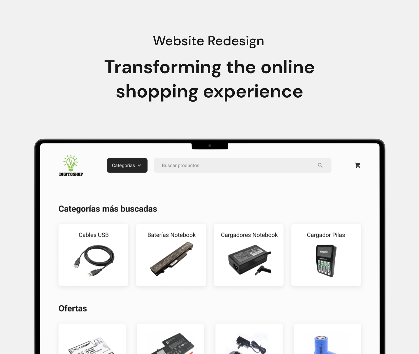
Project summary
Digito Shop is a store where they sell telephone accessories, photography and computer supplies. with more than 10 years of highly recognized experience in the City of Buenos Aires.
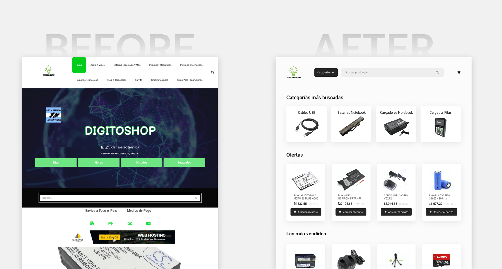
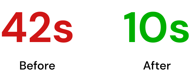
After identifying certain usability issues on the website, we carried out a complete redesign of the website. As a result, the time it takes to find a product has been significantly reduced, from 42 seconds in the previous version to just 10 seconds in the redesign.
Role
UX/UI Designer
Duration
4 weeks
Learn about the business:
Interview with stakeholders
The website was inactive for several years and now they would like to redesign it to give it a more modern look and improve the user experience, with the aim of increasing the number of sales.
First impressions of the website
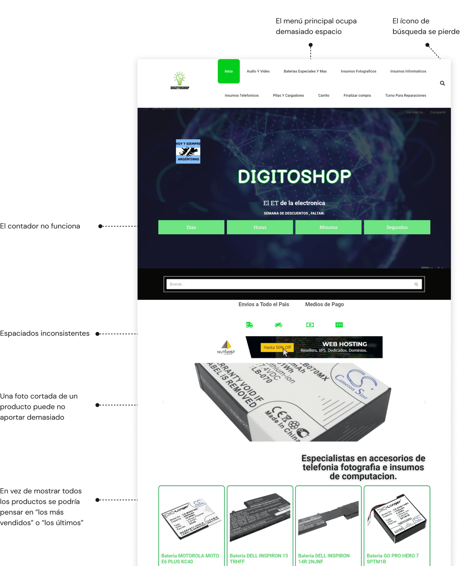
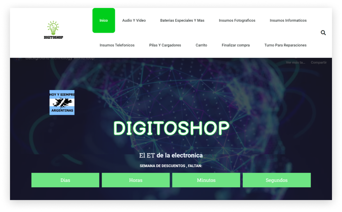
First of all, I carefully examined the website in order to familiarize with its structure and functionalities. Next, I elaborate some hypotheses about its usability, which I'm going to test through usability tests.
Learning from the user
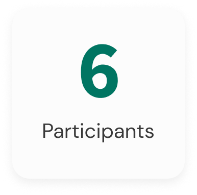
I carried out usability tests on the current website with a group of 6 people in order to understand the needs, expectations and pain points of the users.
The findings
Search products
5 users experienced difficulties as they had trouble locating the search form.
Despite trying to search by category in the menu, they found that the menu was overloaded with information and did not include all the necessary categories.
Categories
4 users encountered problems accessing a subcategory, as the items were too large and the icons were not clear
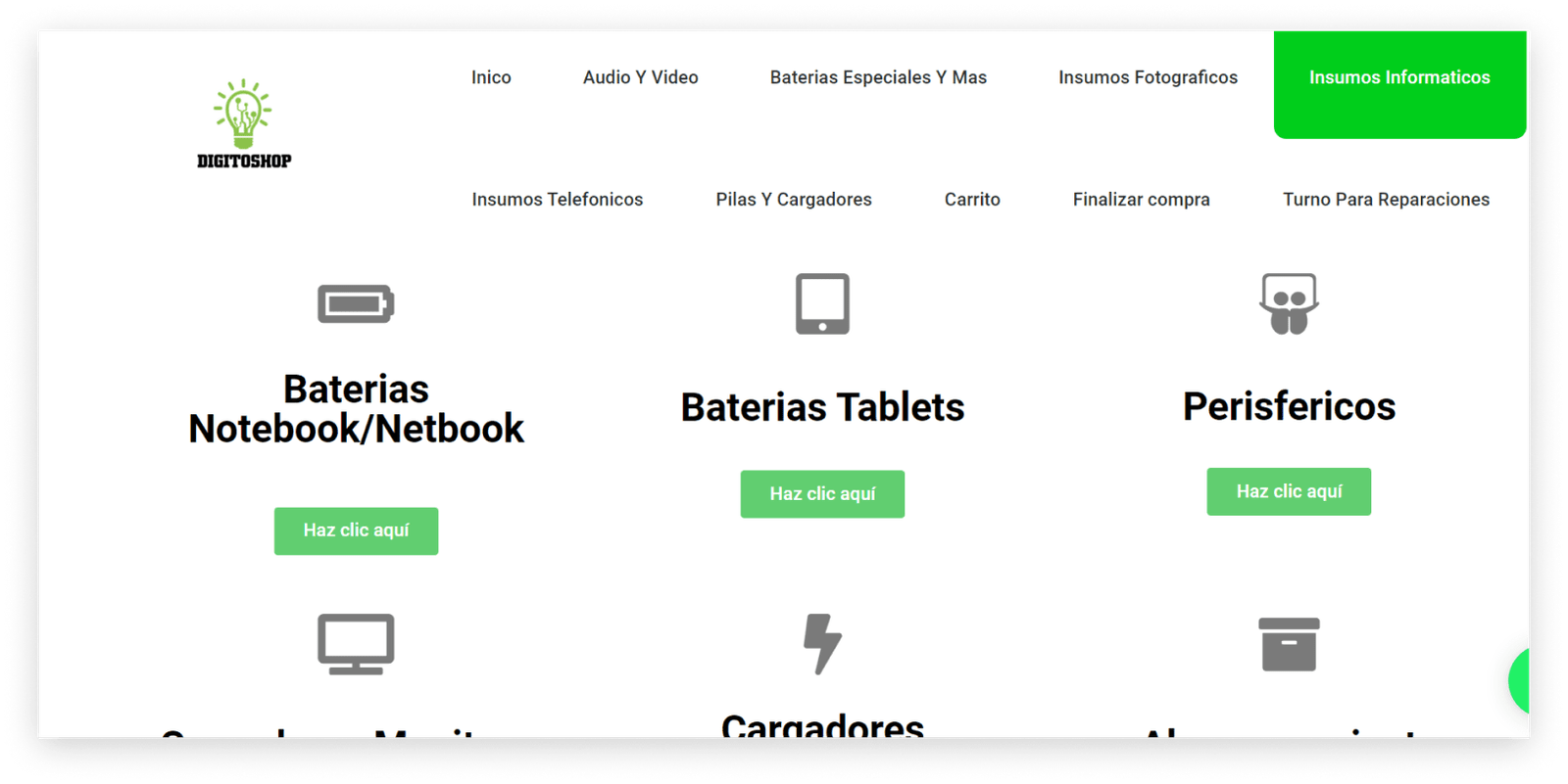
Product list
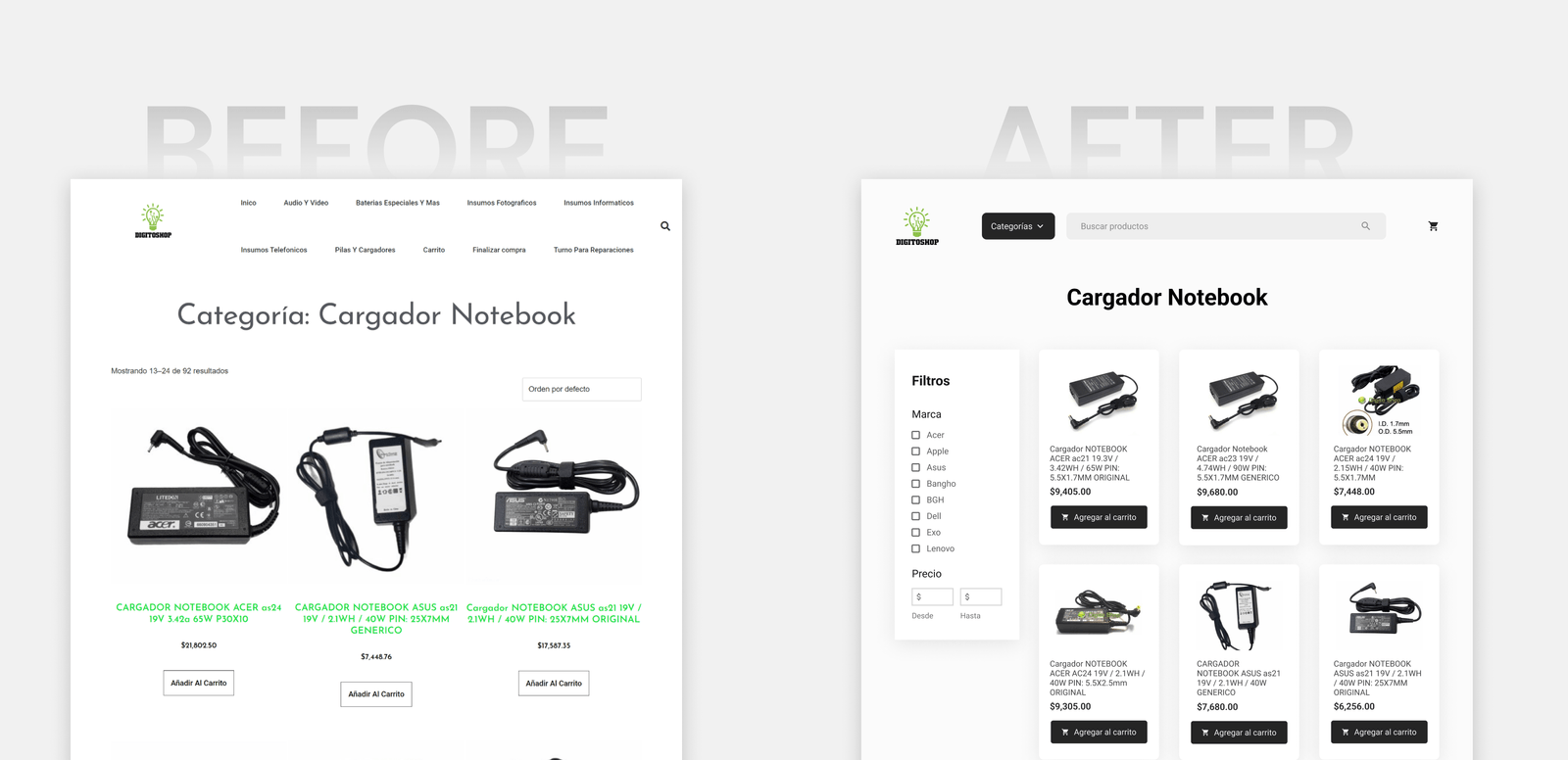
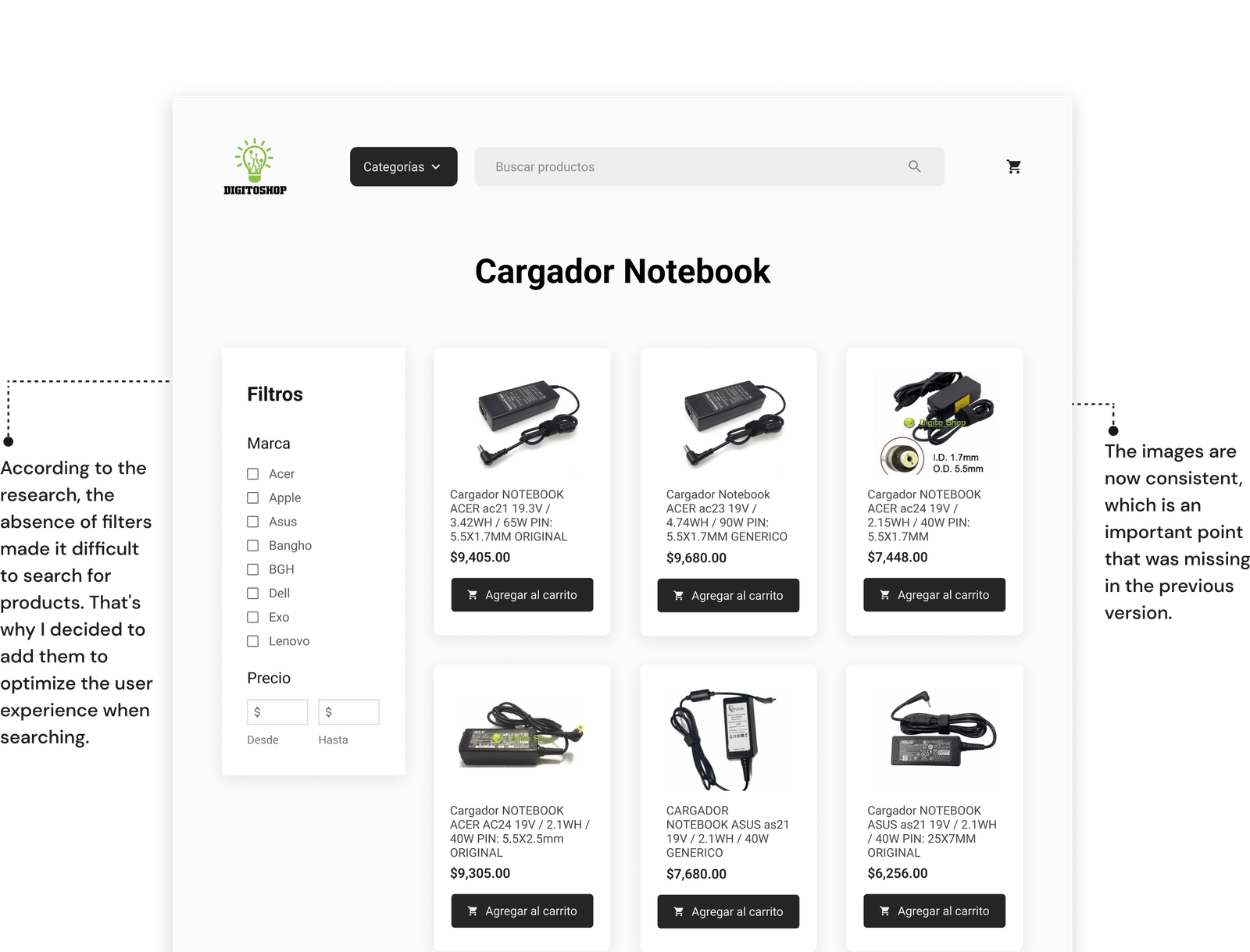
4 users could not find the product they wanted because the images were large and different in size, which made it difficult to see them clearly.
3 users did not find useful filters to search products efficiently. Specifically, they mentioned that they couldn't find the price filter, which they consider to be the most important.
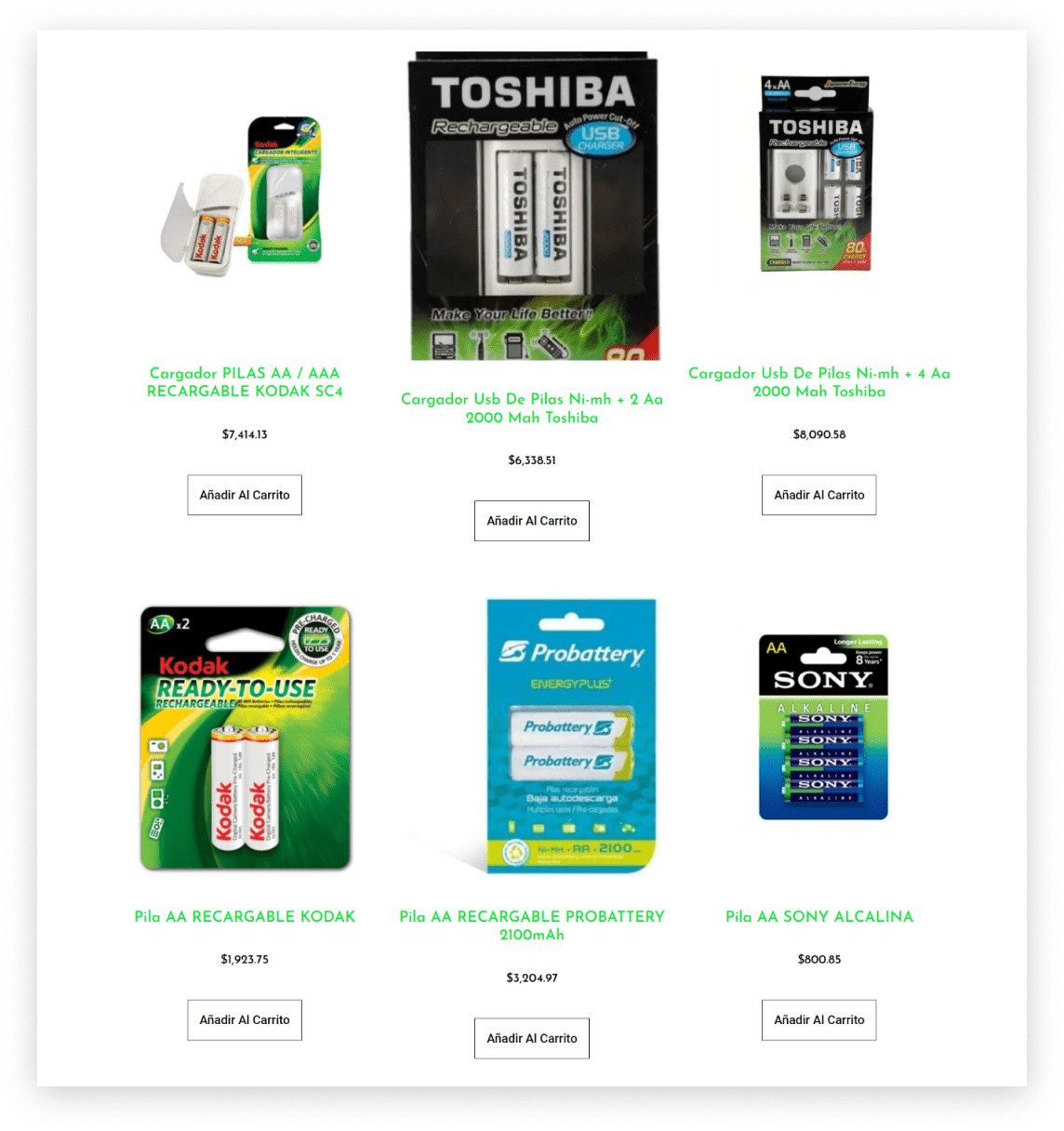
How does the competition do it?
I compiled the strengths and weaknesses of the top 3 competitors, and analyzed the key metrics I discovered during the research.

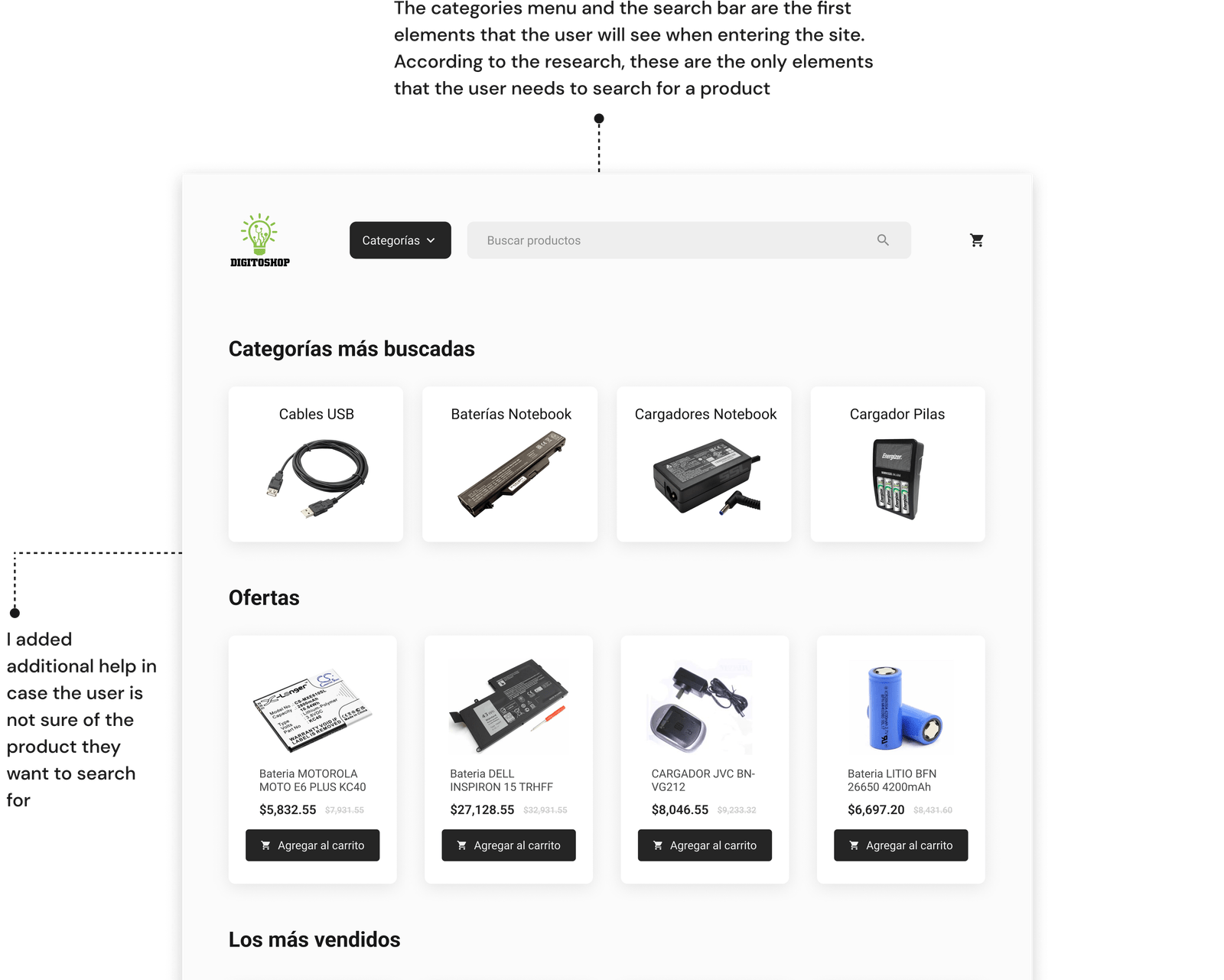
I found that competitors place the search form prominently on their home page, which effectively captures the user's attention.
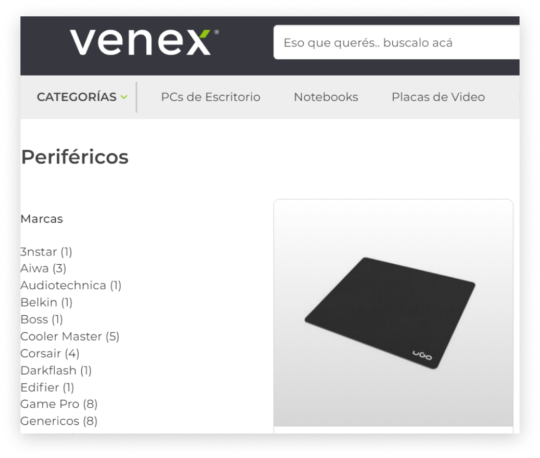
They also have a wide selection of filters, which makes searching easier and more precise.
Think about the solution
I made a User Journey Map on the current website to identify user pain points and think about possible improvements.
- Optimize the main menu so that it is simple and contains the necessary categories
- I could highlight the form to make it easily accessible
- Make sure that the list of products has the necessary filters to optimize the search
Exploring an initial solution
My goal when designing the sketches was to improve the product search experience by prioritizing the search form and organizing the main menu more effectively so that it included all the necessary categories.

The main menu has been improved by simplifying it and focusing on the needs of the user. The key was to better organize the categories and provide a clear search engine.
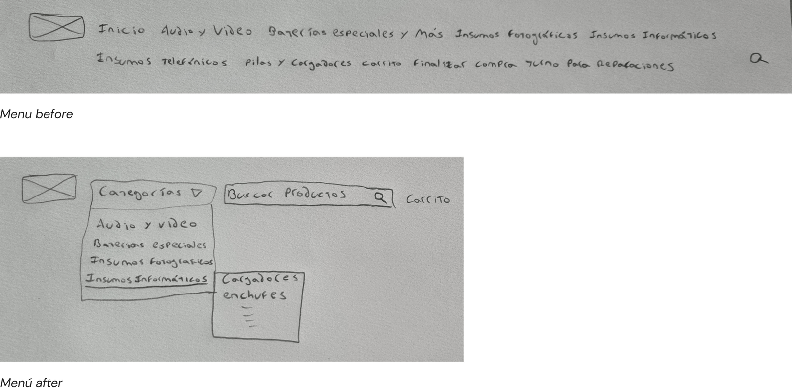
The sketches were successfully validated by the users, which allowed me to continue with the Wireframes.
Designing the structure of the new website
I designed the Wireframes and then carry out a usability test.
6 users participated in a usability test in which they were able to complete the task without difficulty and expressed their satisfaction with the design of the new website.
The final solution
I already have all the information to put together the final design, which will then be tested by users
Results based on usability tests
Average time (in seconds) that a user takes to find a product:

Let's stay in touch
