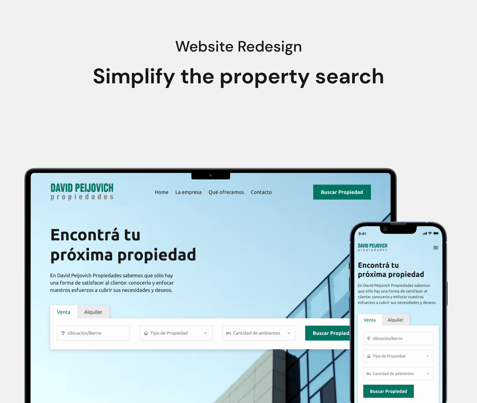
Project summary
David Peijovich Propiedades is a real estate agency with more than 60 years of highly recognized experience in the City of Buenos Aires.
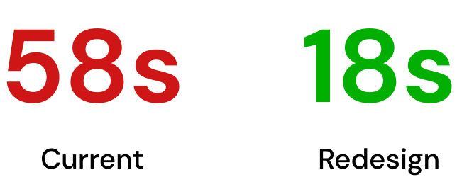
After identifying certain usability issues on the website, we carried out a complete redesign of the website. As a result, the time it takes to find a property has been significantly reduced, from 58 seconds in the previous version to just 18 seconds in the redesign.
Team
Jonathan Lifschitz (UX/UI Designer)
Agostina Sanchez (UX/UI Designer)
Role
UX/UI Designer.
We work remotely in collaboration, since Agostina lives in Mendoza and I live in Buenos Aires.
Duration
4 weeks
Learn about the business:
Interview with stakeholders
The website was inactive for several years and now they would like to redesign it to give it a more modern look and improve the user experience, with the aim of increasing the number of inquiries received.
First impressions of the website
First of all, we carefully examined the website in order to familiarize ourselves with its structure and functionalities. Next, we elaborate some hypotheses about its usability, which we are going to test through usability tests.
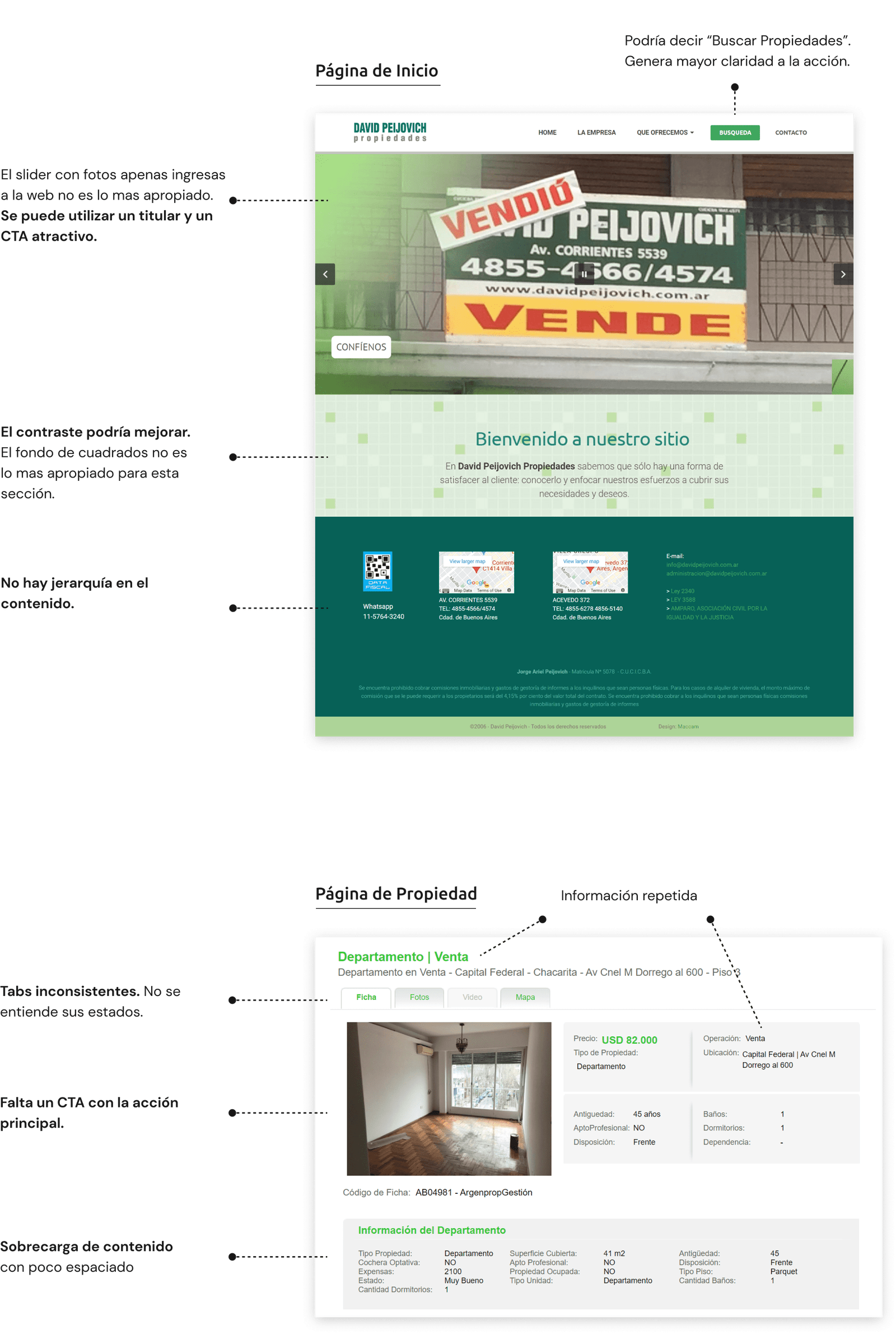
Learning from the user
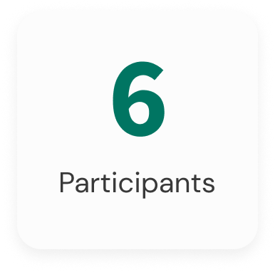
We carried out usability tests on the current website with a group of 6 people in order to understand the needs, expectations and pain points of the users.
The findings
Search for a property

5 users had difficulties during this stage, as they expected the search form to appear directly.
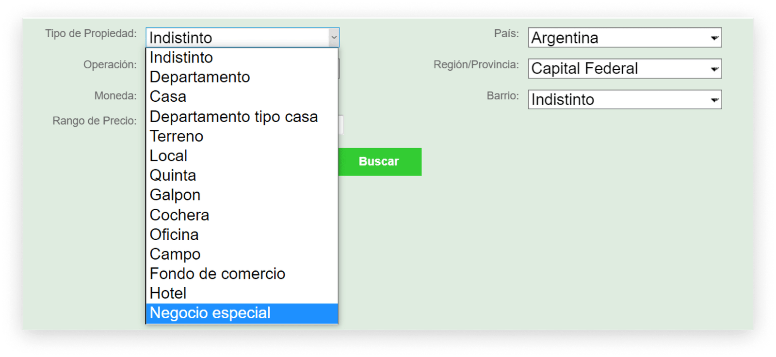
Search form
4 users had difficulties finding the "Rooms" field, which is key to specifying the desired characteristics in a property.

The "Property Type" field presented difficulties for 5 users, who reported problems understanding some options, such as "Special Business".
Property page
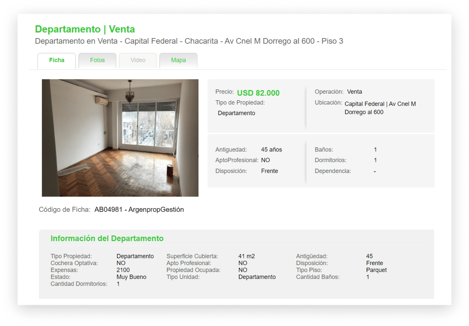
All users who tried to request more information about the property ran into difficulties, as there is no option to perform such a task.
How does the competition do it?
We compiled the strengths and weaknesses of the top 3 competitors, and analyzed the key metrics we discovered during the research.

We found that competitors place the search form prominently on their home page, effectively engaging the user.
Think about the solution
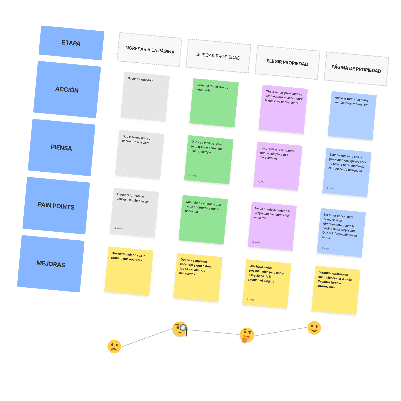
We made a User Journey Map on the current website to identify user pain points and think about possible improvements.
- We could highlight the form to make it easily accessible
- Make sure the form is easy to understand and contains all the necessary fields
- Add a form to the property page so users can request more information
Designing the search flow
We designed the sketches with the purpose of simplifying the search for properties, reducing the number of steps required from 5 screens in the current version of the website to only 3 in our redesign proposal.
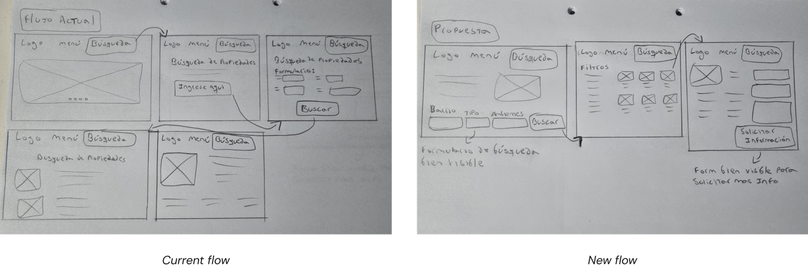
The sketches were successfully validated by the users, which allowed us to continue with the Wireframes.
Designing the structure of the new website
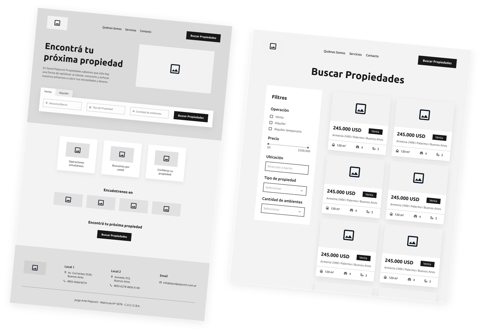
We design the Wireframes and then carry out a usability test.
6 users participated in a usability test in which they were able to complete the task without difficulty and expressed their satisfaction with the design of the new website.
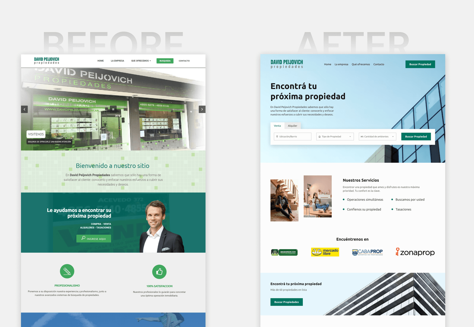
The final solution
We already have all the information to put together the final design, which will then be tested by users
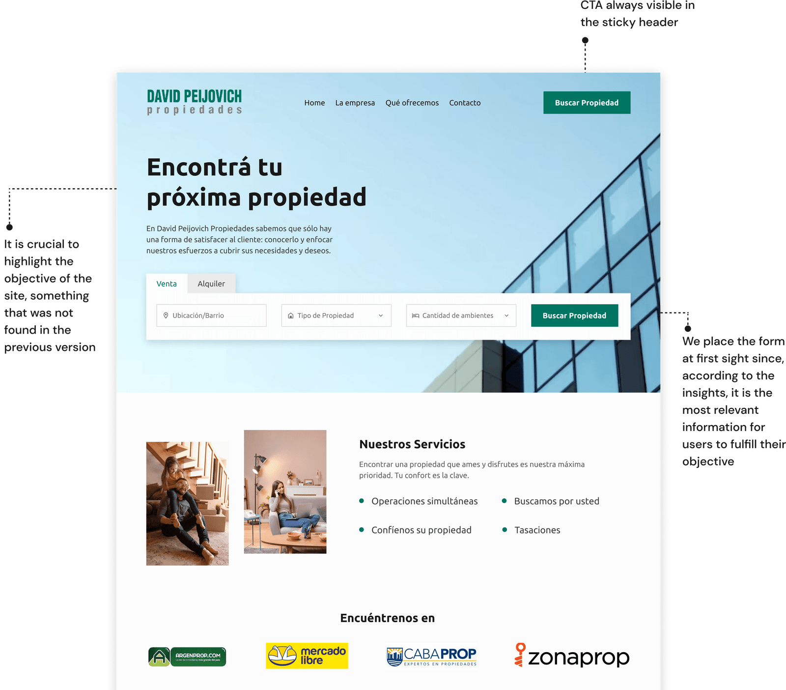
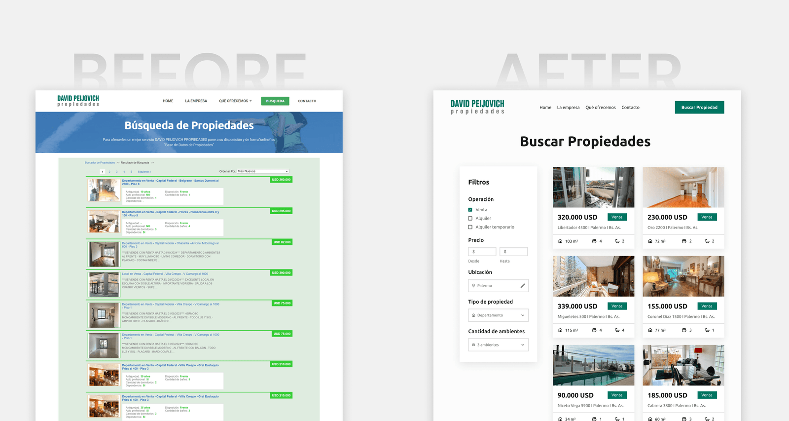
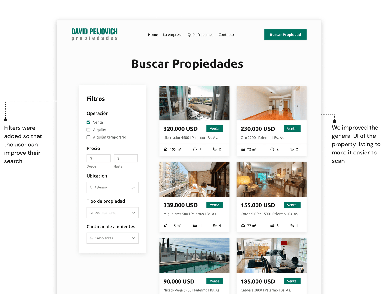
Results obtained through usability tests
Average time (in seconds) that a user takes to find a property

Let's stay in touch
