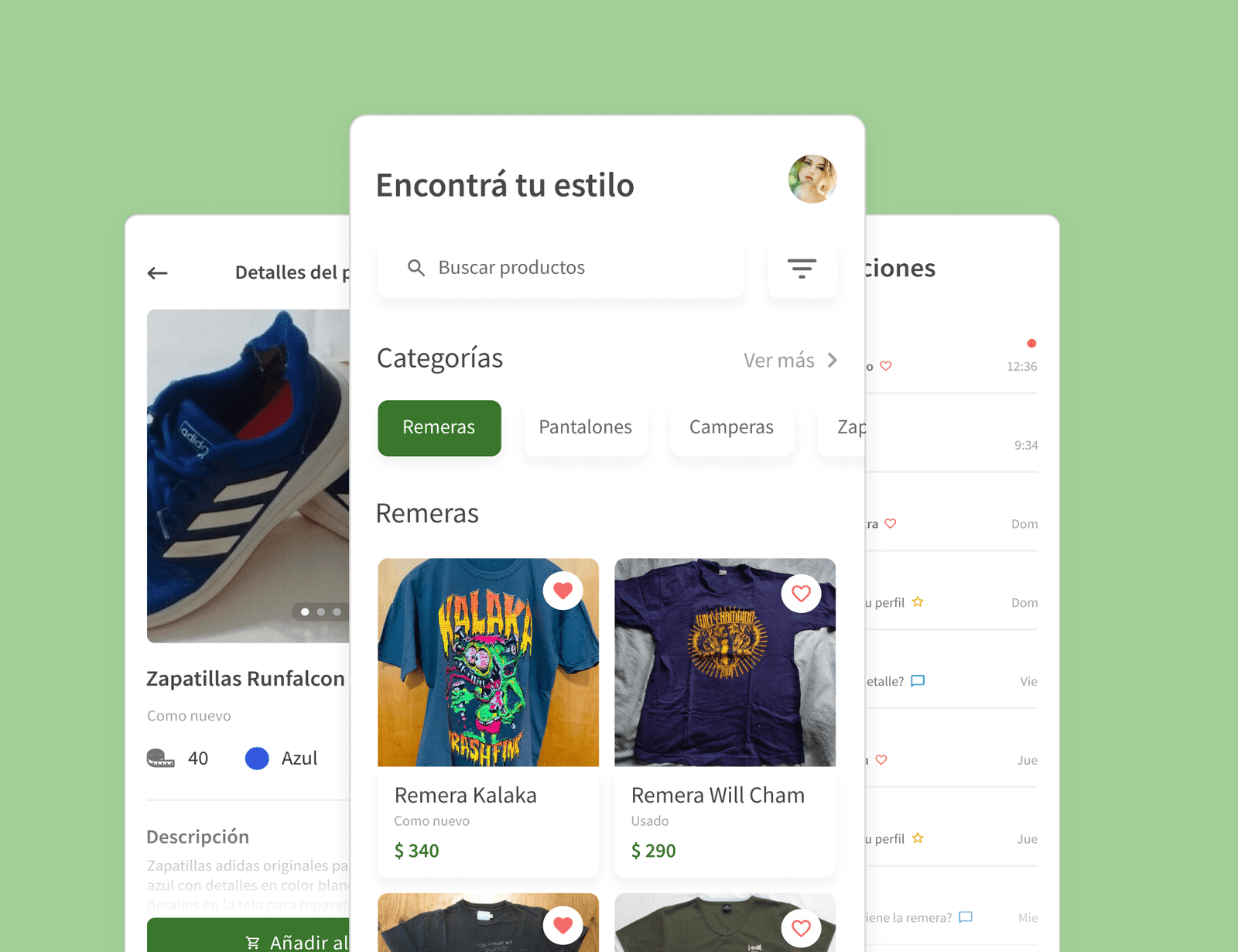
Shoppy
App to buy and sell second-hand clothes.
CONTEXT
Project as a student
Duration
3 months
ROLE
UX/UI Design
Problem
- 20% of the world's wastewater comes from the fashion industry.
- 500,000 tons of microfiber are thrown into the sea every year.
- Little information about places to sell clothes you no longer wear.
- Many people do not know where to buy or sell second-hand clothes.
PROPOSAL
- Users will have a rating system so you can know who you are buying from.
- You can sell the clothes you no longer wear.
- There will be a local map so you can find the one closest to your location.
RESEARCH
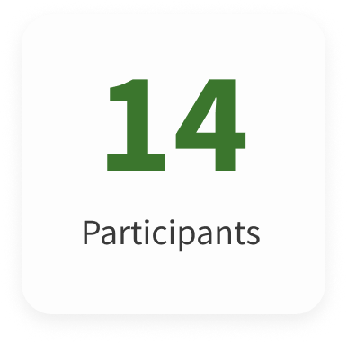
Once the problem and its solution were established, I decided to send a survey in order to better understand the needs and inconveniences of users when buying second-hand clothes.
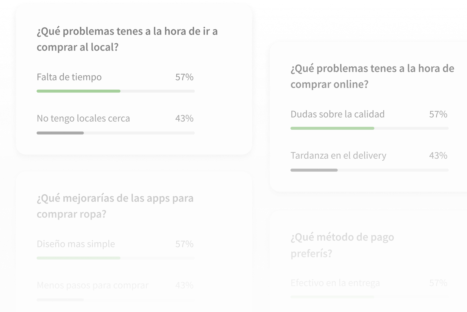
SURVEY INSIGHTS

BENCHMARKING
I navigated the applications in their entirety to see how the buying and selling system works. I also collected several user opinions.

BENCHMARKING INSIGHTS
USER PERSONA
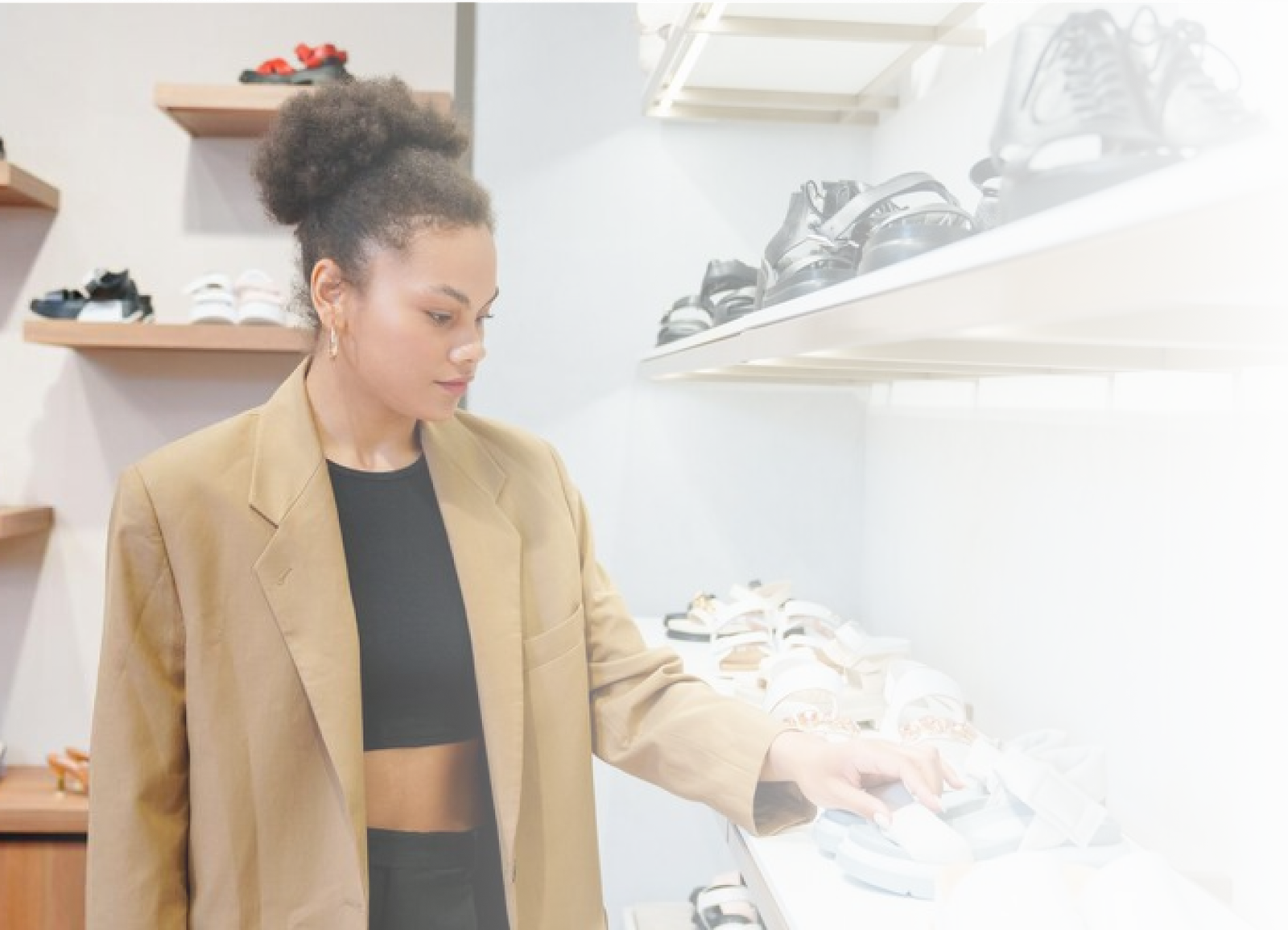
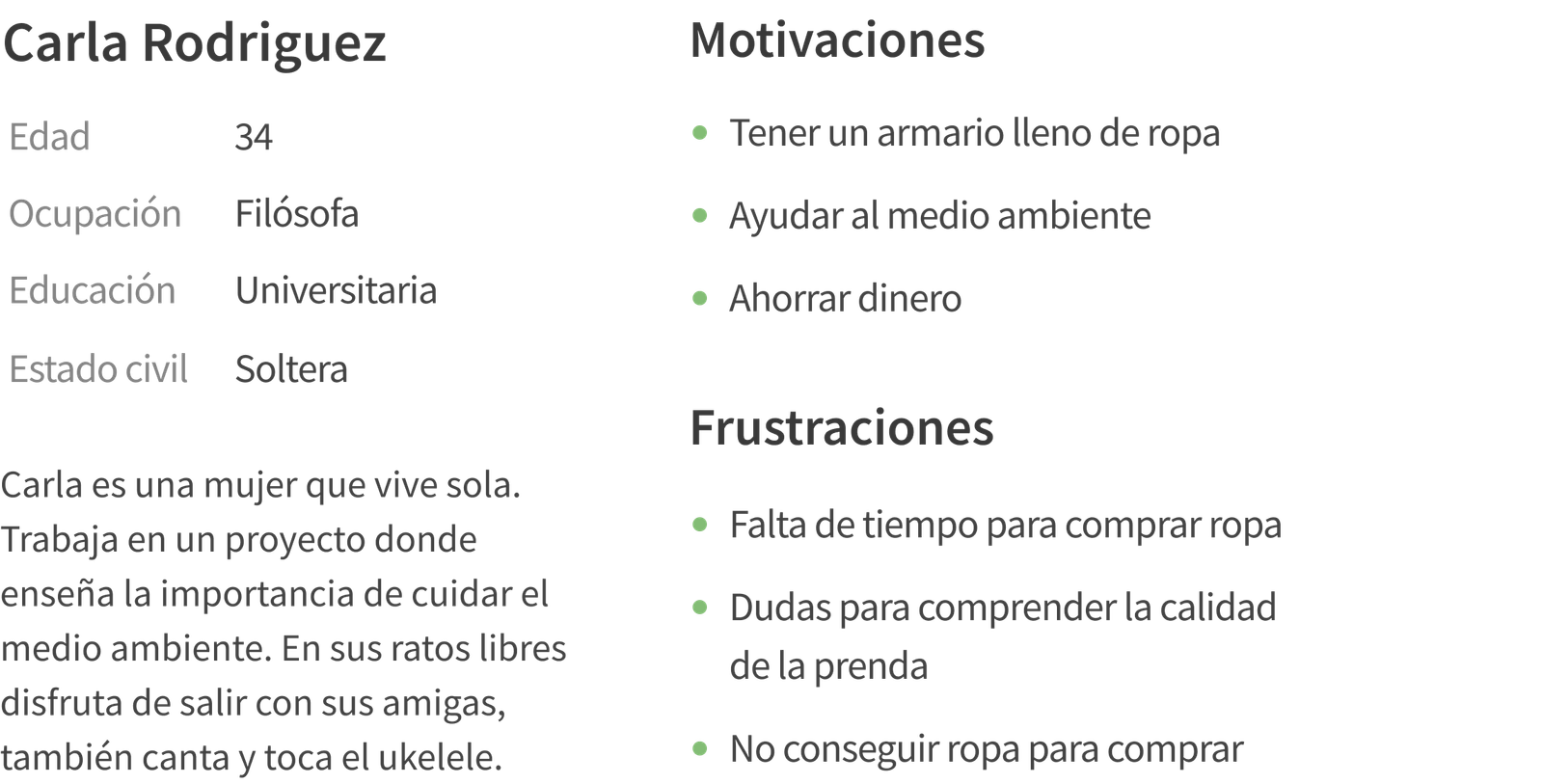
I developed the User Persona and the Empathy Map, based on the results of the previous survey, in order to understand who would be the ideal user of my app. It will also allow me to reach a deeper level in terms of user motivations and frustrations.
USER JOURNEY MAP
I then developed a visual representation of the user journey in the app to better understand where they might have problems, also clarifying what solutions the app will provide.


USER JOURNEY MAP INSIGHTS
WIREFRAMES
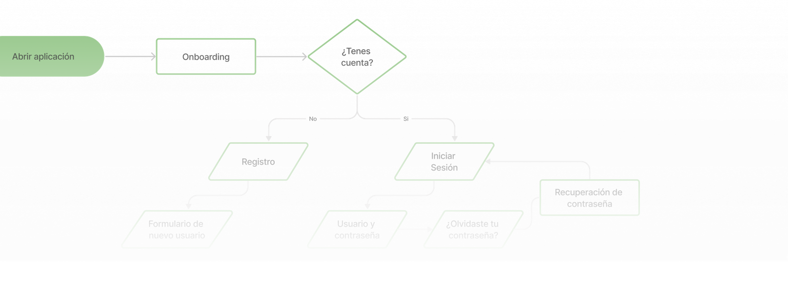
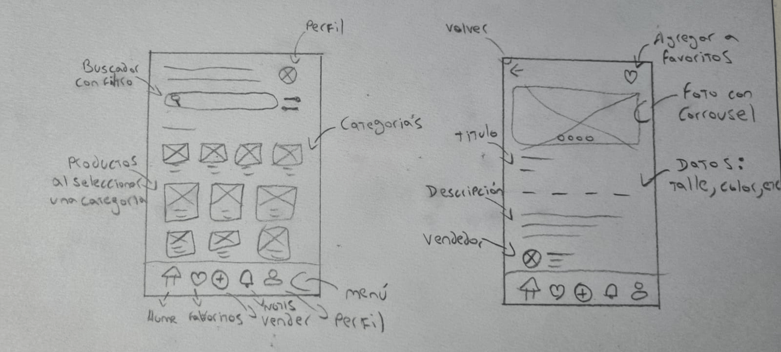
Once the User Flow was finished I started to create the low quality Wireframes in pencil and paper, so that I could make all the necessary corrections before going to the PC.
UI KIT
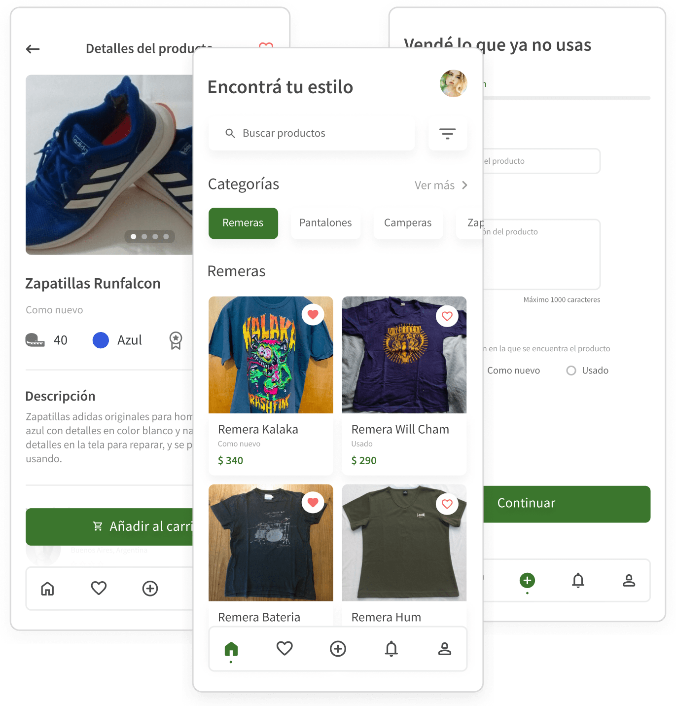
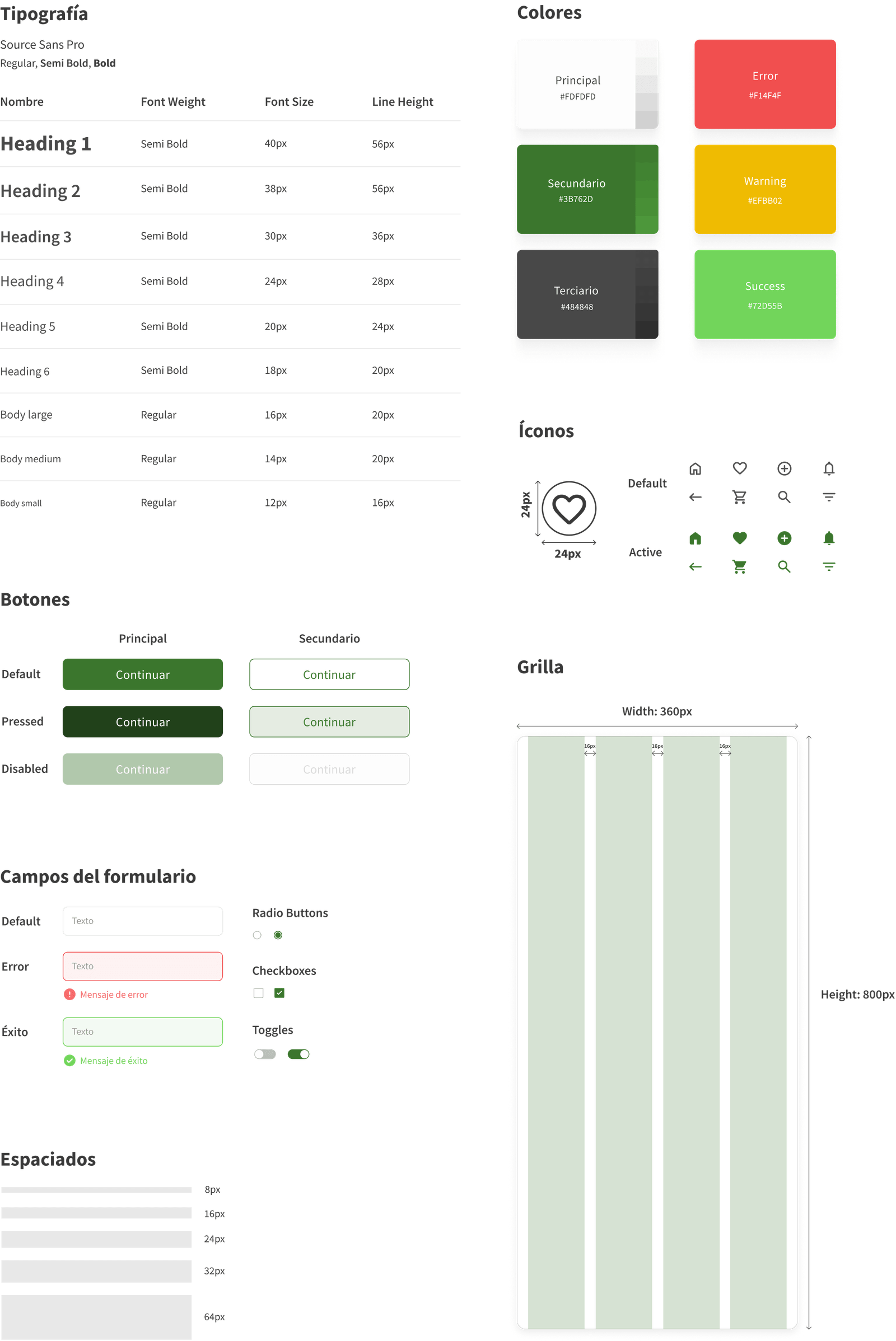
Before creating the High Fidelity Wireframes, I proceeded to put together the UI Kit. I decided to use a Sans Serif font, which represents the modernity that the app requires. The main color is green, symbolizing sustainability and the environment.
FINAL DESIGN
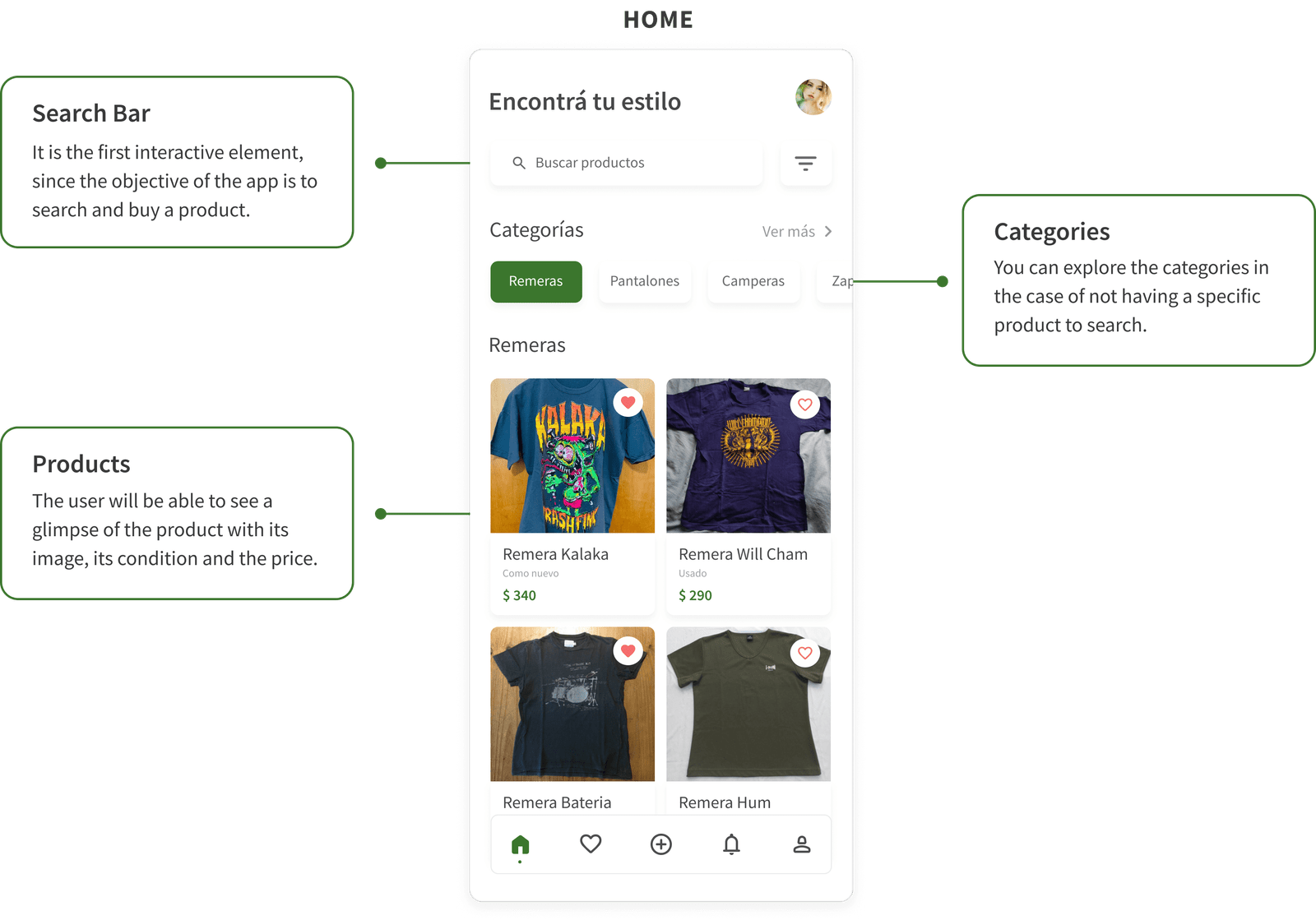
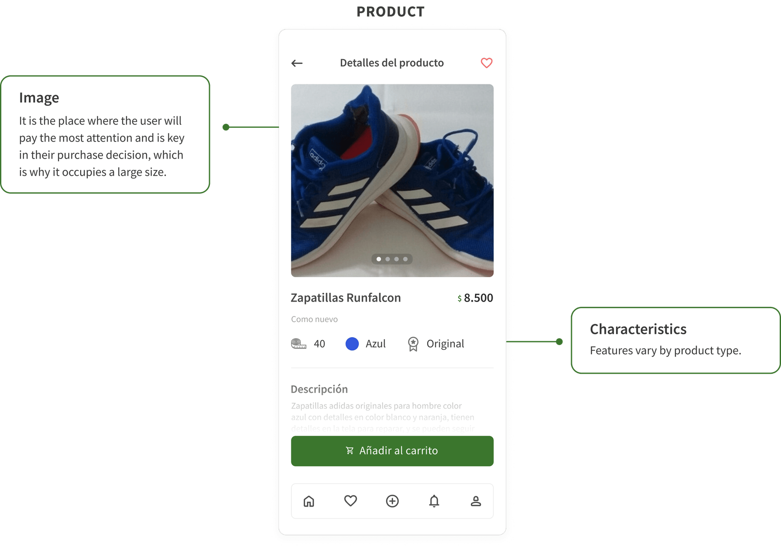
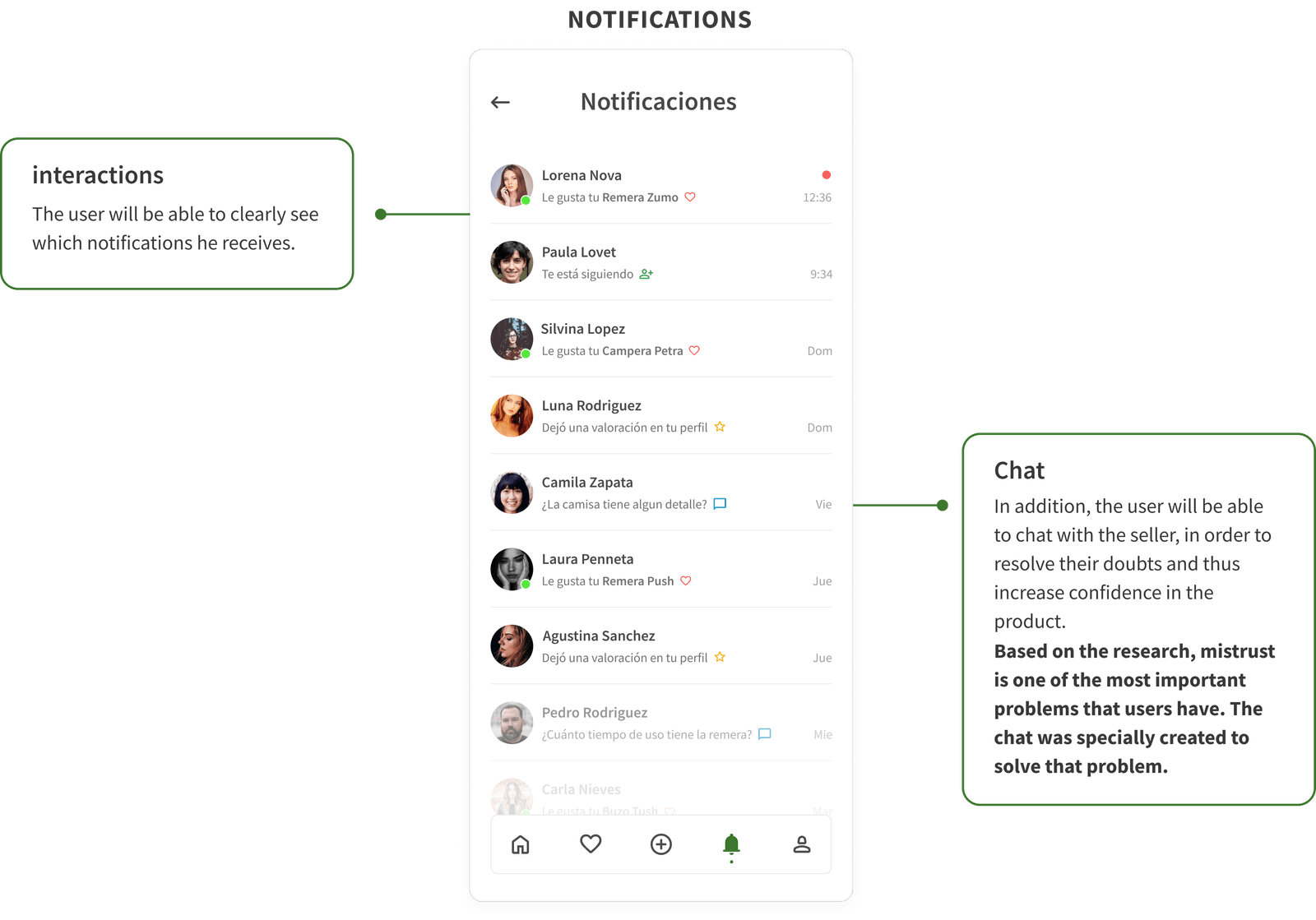
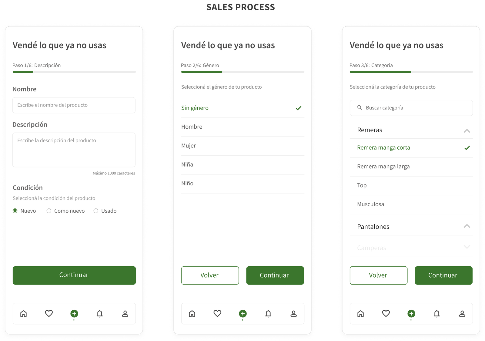
The number of steps remaining to complete the process was one of the key elements when designing these screens. This allows the user to know at all times the step in which he is and how much is left to finish.
Based on Benchmarking insights, the sales process is often complex and confusing. That's why I designed it to be simple and easy to use.
USABILITY TESTING
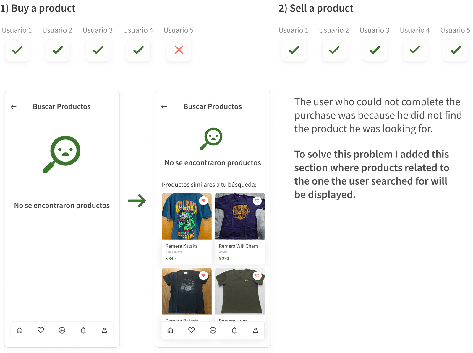
The objective of the usability tests was to verify the ease of use of the app. FIVE users were carried out via Skype where they performed the following tasks:
LESSONS LEARNED
1) Explain the “why” of each decision
Explaining the “why” of each decision increases my knowledge and respect as a UX/UI Designer. Thanks to the "why" I learned to make better decisions both in the investigation and in the interface.
2. Ask for feedback
I learned a lot by paying attention to the comments of the most experienced. I didn't let my own thoughts stop me from wondering if the decisions I was making were the best for the solution my users were expecting.
Let's stay in touch
